

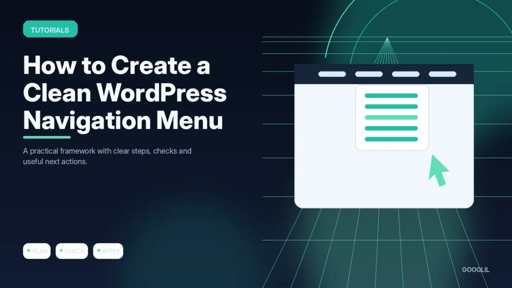
Navigation should help visitors understand the site’s main destinations without forcing them to decode internal terminology. A small, clear menu usually works better than exposing every page.
1. Choose primary destinations
Put the pages most visitors need in the primary navigation and keep the list short enough to scan quickly. Prioritise destinations such as services, key topics, About and Contact rather than exposing every page in the menu.
2. Group related pages
Use dropdowns only when several destinations genuinely belong together and the grouping label is understandable. Avoid deep multi-level menus; important pages should normally be reachable within one or two clear choices.
3. Keep labels short
Use concise labels that describe the destination in familiar language, such as “WordPress,” “Reviews” or “Contact.” Avoid clever wording that forces visitors to guess where a link goes, especially on mobile where menu space is limited.
4. Test on mobile
Test the real interaction on a phone-sized screen. Navigation, forms, text size, tap targets and layout stability matter more than simply passing a responsive breakpoint.
Design the menu around tasks
Choose the handful of destinations most visitors need, use short descriptive labels and group secondary pages only when the relationship is obvious. Keep dropdown levels shallow, avoid duplicate paths with different labels and test the mobile menu with touch. Important legal pages can live in the footer when they are not primary navigation tasks.
A simple publication menu
A content site might use Home, Blog, Explore, About and Contact at the top, with topic categories under Explore. Privacy, Terms and Editorial Policy can remain in the footer. That keeps the header focused while every important page remains reachable.
Practical example
For a small publication, a primary menu might need only Home, Blog, a compact Explore menu, About and Contact. Put policy pages in the footer unless readers need them during normal navigation. Test the menu at mobile width and make sure every label predicts the destination. A clean menu reduces decision fatigue and helps both users and crawlers reach important sections without deep nesting.
Design navigation around the pages visitors need most
A clean WordPress menu is a prioritisation exercise. List the pages that support the main visitor journeys, group closely related items and keep labels familiar. The primary menu should not contain every page on the website. Policies, account utilities and less important archives can usually live in secondary navigation or the footer.
In the WordPress menu or navigation editor, add only the required pages, categories or custom links, then arrange hierarchy carefully. Use short labels that match the destination page. Test dropdowns with keyboard navigation and on a narrow mobile screen. Avoid deep multi-level menus unless the content structure genuinely requires them.
- Use one consistent destination for the logo and Home link.
- Remove duplicate menu items created during theme or template changes.
- Check that category labels still make sense as the site grows.
- After changing URLs, update menu links directly rather than relying on redirects indefinitely.
Watch whether visitors can reach key sections without searching or repeatedly using the back button. A smaller menu often performs better when labels and information architecture are clear.
What to avoid when working on a clean WordPress navigation menu
- Adding every page to the menu.
- Using vague labels. Replace the vague instruction with a specific audience, outcome and next action that can be checked.
- Building too many dropdown levels. Simplify to one primary approach first, prove it works, then add complexity only for a clear reason.
Quick checklist for a clean WordPress navigation menu
- Choose primary destinations.
- Group related pages.
- Keep labels short.
- Test on mobile.
Design navigation around the pages visitors need most
A clean WordPress menu is a prioritisation exercise. List the pages that support the main visitor journeys, group closely related items and keep labels familiar. The primary menu should not contain every page on the website. Policies, account utilities and less important archives can usually live in secondary navigation or the footer.
In the WordPress menu or navigation editor, add only the required pages, categories or custom links, then arrange hierarchy carefully. Use short labels that match the destination page. Test dropdowns with keyboard navigation and on a narrow mobile screen. Avoid deep multi-level menus unless the content structure genuinely requires them.
- Use one consistent destination for the logo and Home link.
- Remove duplicate menu items created during theme or template changes.
- Check that category labels still make sense as the site grows.
- After changing URLs, update menu links directly rather than relying on redirects indefinitely.
Watch whether visitors can reach key sections without searching or repeatedly using the back button. A smaller menu often performs better when labels and information architecture are clear.
Frequently asked questions
How many top-level menu items should I use?
Use only the destinations that deserve constant visibility. There is no fixed number, but overcrowding is a sign to group or prioritise.
Should category names appear in the menu?
Yes when categories are meaningful to readers. A hub such as Explore can keep the top level compact.
What should I test on mobile?
Check tap targets, dropdown opening, scrolling, focus behaviour and whether the logo and utility buttons leave enough space.
Keep Learning
Continue with these related guides: